Krebs Zinc
Black 6 C
Before a customer reads a single word, our label color system communicates Vibrant Health's quality and energy. In a retail environment, color serves as a beacon—creating "brand blocks" on the shelf that make our products instantly recognizable from a distance.
The Vibrant Health color system draws inspiration from the full spectrum of color. This expansive palette enables effective color-coding across a diverse range of product offerings while maintaining a cohesive and recognizable brand presence.
Krebs Zinc
Black 6 C
Boron
5405 C
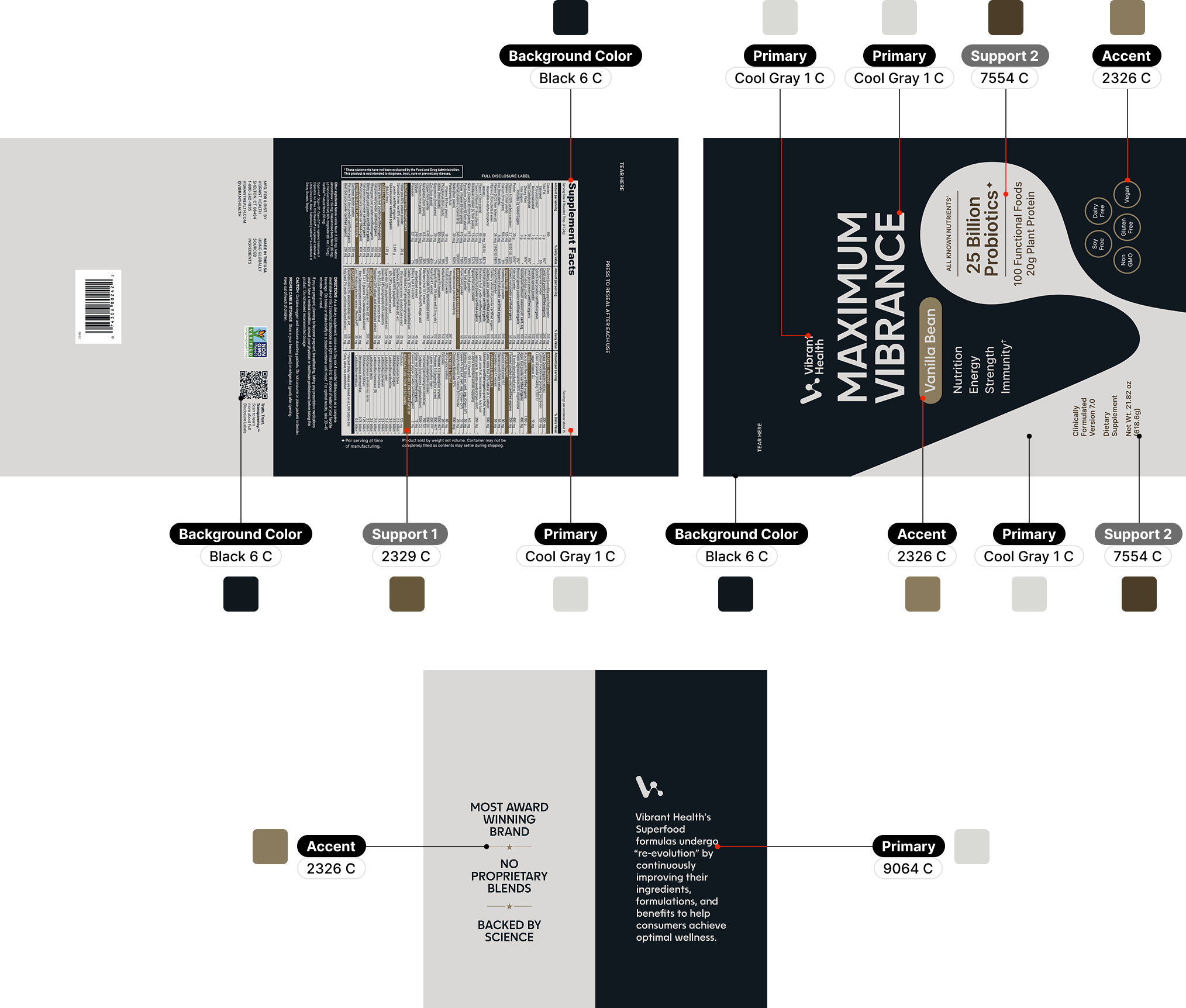
Maximum Vibrance Vanilla Bean
Cool Gray 1 C
Maximum Vibrance Chocolate Chunk
2309 C
Green Vibrance Chocolate Coconut
4101 C
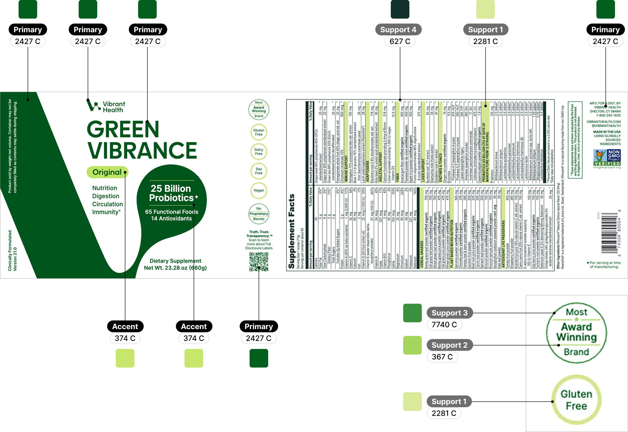
Green Vibrance
2427 C
Trilogy Vegan
350 C
9560 C
Trilogy Non Vegan
316 C
Digestive Vibrance
3135 C
Immune Defense
2726 C
Green Vibrance Blueberry Lemon
2738 C
U.T. Vibrance
2623 C
Cholesterol Vibrance
2593 C
U.T. Probiotic
240 C
Red Marine Algae
7427 C
Spectrum Vibrance
7636 C
Joint Vibrance
185 C
Green Vibrance Peach Mango
2027 C
Vitamin C
152 C
137 C
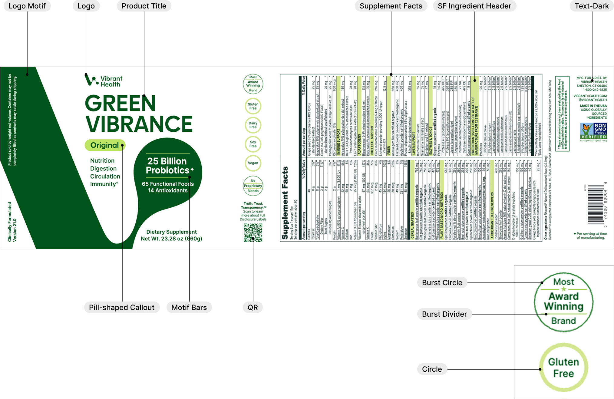
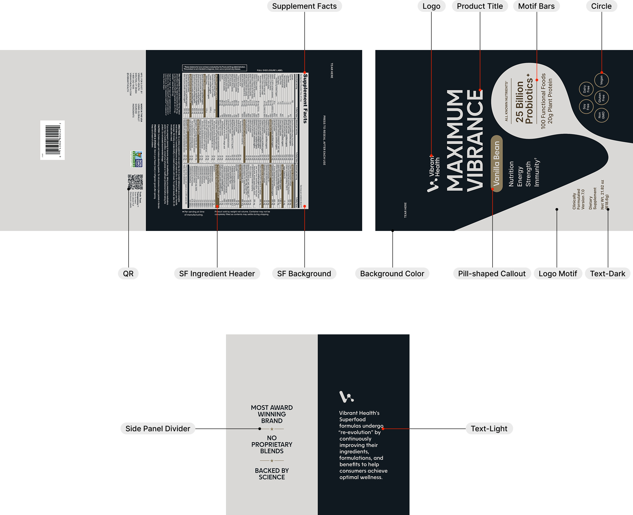
In most product label designs, the primary color from the designated color family is applied to both the product title and the logo motif. This consistent use reinforces the product category and aids in visual organization across the product line.
There are two exceptions to this approach: Trilogy Vegan and Vitamin C. In these cases, a darker shade of the primary color is used for the product title to enhance legibility, while a lighter shade is applied to the logo motif to maintain visual balance and clarity.
For each product label design, an accent color is assigned to the pill-shaped callout located below the product title. This accent color is typically a variation of the primary color to preserve the minimalist, contemporary aesthetic. In some cases, however, a more vibrant accent color is used to highlight a specific flavor—such as the Digestive Vibrance Mandarin Orange—or to enhance visibility for certain product label which has less vibrant primary color, such as Natural Boron.
With the exception of the premium products — such as Maximum Vibrance, which features a black background — all product labels should be designed with a white background. This ensures a clean, modern appearance and a consistent shelf presence across the product line.
Download All
Entire Label Color System PDF