Components
Various button types, other functional components, seals, logos, retailer brand logos, and signature cards.
Buttons
Buttons and interactive components used across the Vibrant Health website.
01 — Primary
Highest visual weight. Use for the single most important action on a screen. Filled navy with white type — supports icon-left and icon-right variants.

02 — Primary: Special Combination
Extended label combining light + semibold type weights with an icon. Use when additional context is needed alongside the primary action label.

03 — Primary: Special Combination
Transactional CTA combining icon, label, and price. Use for Add to Cart and purchase actions where showing the price reinforces the decision.

04 — Secondary
Supporting actions that complement but don't compete with the Primary CTA. Navy outline with navy type — supports icon-left and icon-right variants.

05 — Tertiary
Use for contextual or product-specific selections within product cards and detail pages.

06 — Tertiary
Compact pill for product-pairing recommendations and quick add CTAs.

07 — Tertiary: Flavor
Product Detail Page — flavor selection. Allows customers to choose a product variant. Two states: default and active.

08 — Tertiary: Serving
Product Detail Page — serving size selection. Three states: default, active, and best value.

Utility Components
Seals, logos, retailer brand logos, and signature cards used across the Vibrant Health website.
01 — Inputs & Controls
Form fields for user input, search, and quantity adjustment.

02 — Selection Controls
Product variant selectors and form selection elements with all interactive states.

03 — Chips & Badges
Informational-only chips for pricing and product callouts. Not interactive.

04 — Star Rating
Product rating component — filled and outline states for interactive use.

05 — Carousel & Pagination
Navigation indicators for carousels and paginated lists.

06 — Icon Buttons
Compact utility buttons for secondary actions: filter, sort, navigation, and cart.

07 — TextLink
Inline anchor text that triggers navigation or actions. Supports default, hover, and visited states.

08 — Animated Button
Scroll-trigger CTA with motion indicator. Used for page-level navigation prompts.

09 — Seals
Rotate 10 degrees in primary use. Secondary rotations include 0 and -10 degrees.

Logos
VH brand marks and approved retailer logos. Use only these assets for digital and print applications.
01 — Brand Primary Logo: Two Lines

02 — Brand Secondary Logo: One Line

03 — Brand Alternate Logo: Initials

Retailer Brand Logos
A collection of retailer brand logos showcased throughout the VH website.

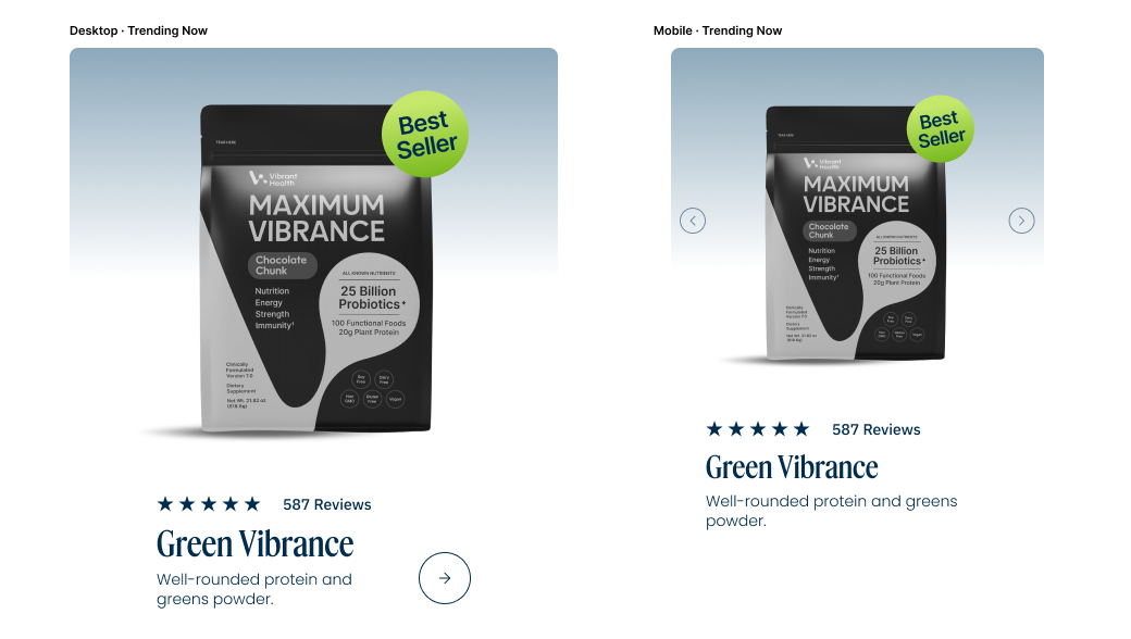
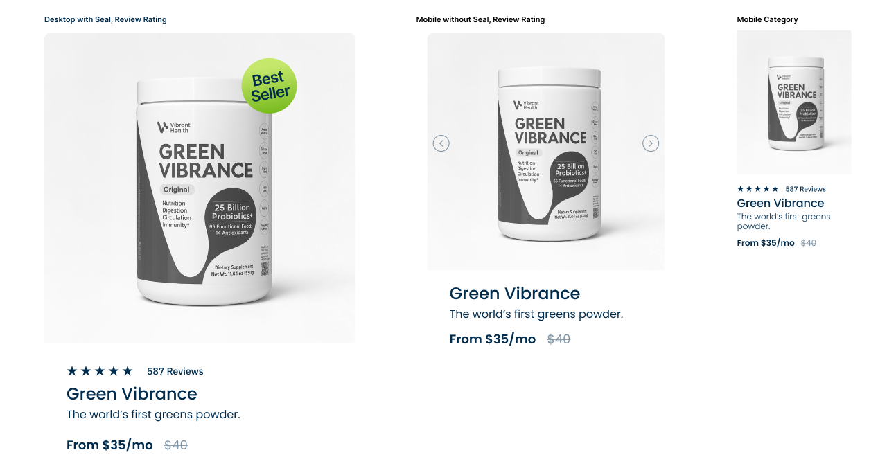
Product Cards
Product card templates for PDP, homepage, and category pages. Desktop and mobile variants shown.
01 — Best Seller and Category
Primary product card with hero image, trust badges, star rating, and Add to Cart. Used on homepage featured sections.
02 — Trending Now
Promotional card with lifestyle imagery and CTA. Used on homepage trending section.