Typography
This outlines typographic hierarchy and styling rules specific to Vibrant Health’s physical products. By balancing brand expression with functional legibility, we ensure that every box, bottle, and bag speaks clearly, stays compliant, and remains unmistakably ours.
Packaging Typeface Combination
By pairing distinct typefaces, we create a visual rhythm that separates our brand's "hooks"—like product names and slogans—from the functional "details"—such as ingredients and instructions.
The goal of our type pairings is to ensure the primary brand font provides the personality, while the secondary font provides the utility. When executed correctly, these combinations make the packaging feel organized, professional, and effortless to navigate. To maintain a cohesive look across all product lines, use the following approved combinations.
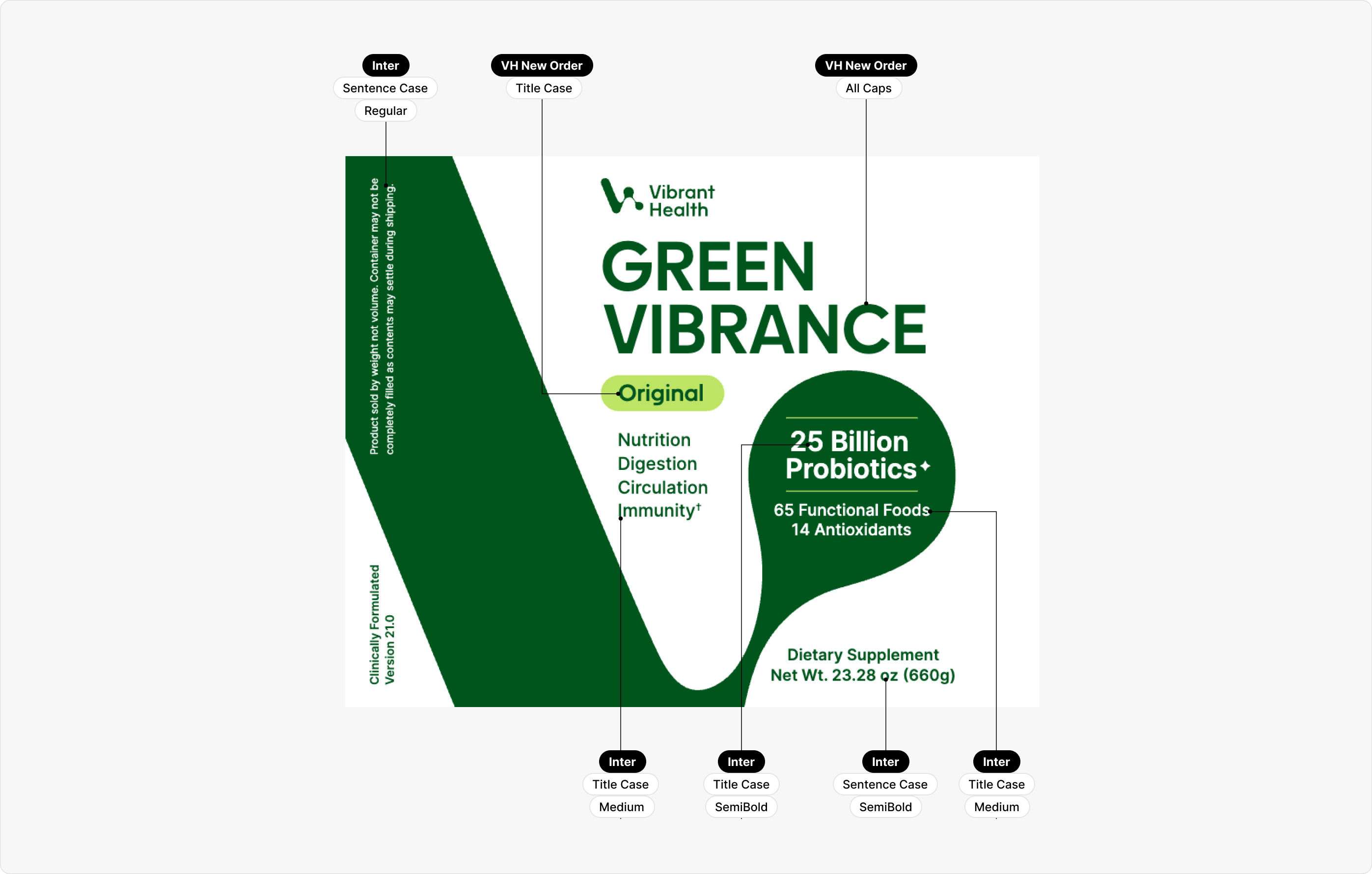
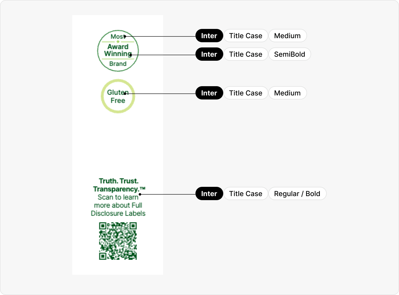
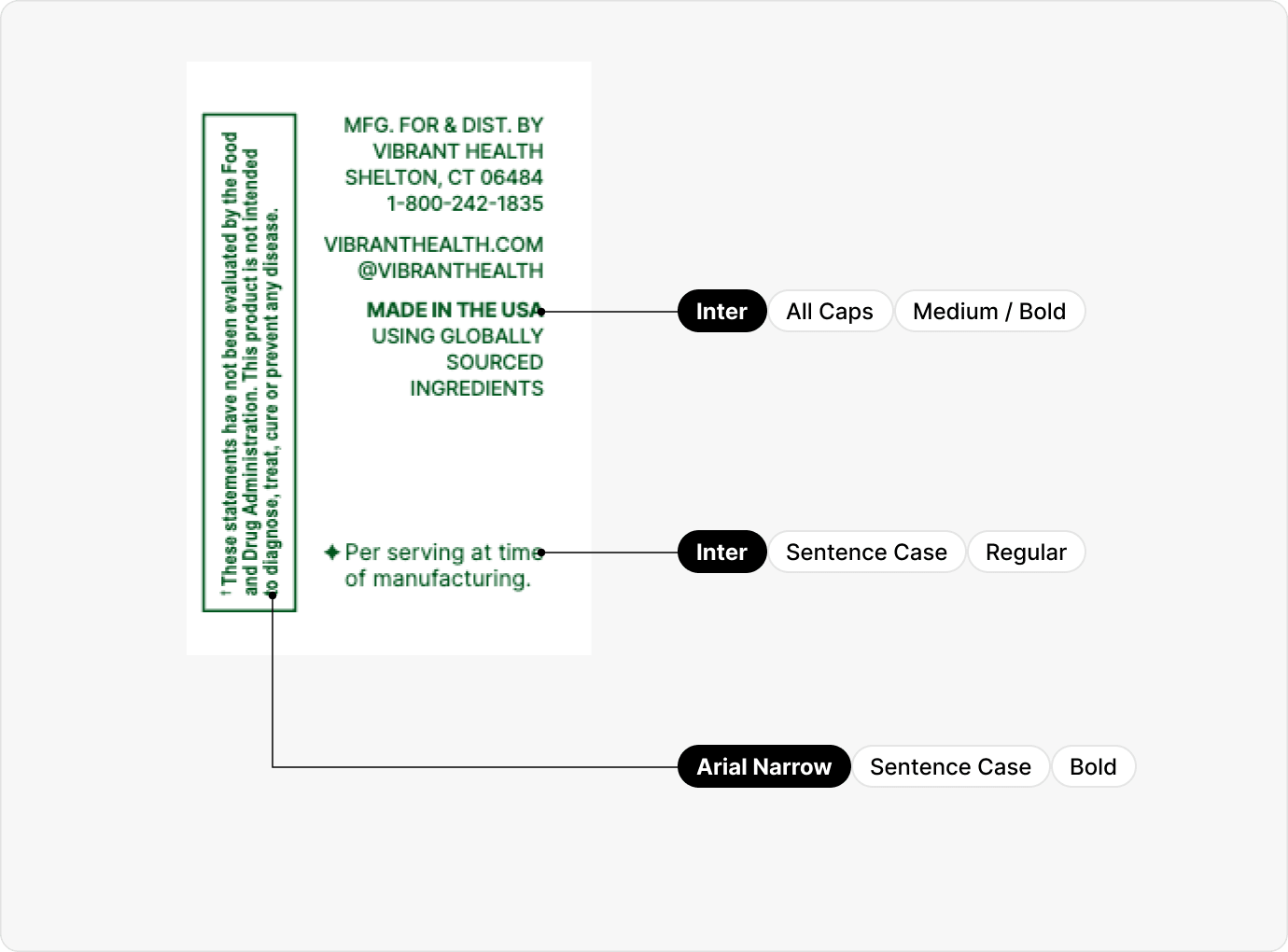
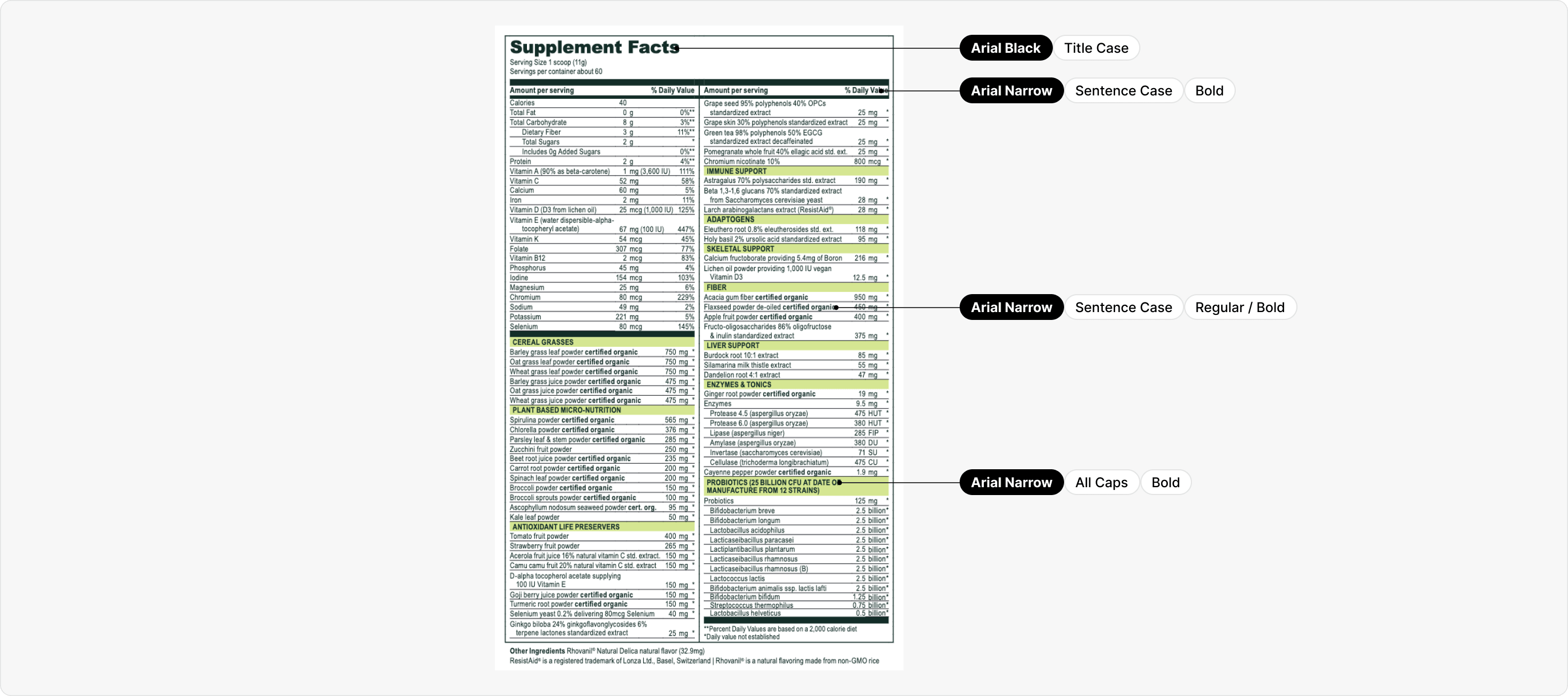
Packaging Typeface Usage
The diagrams below visualize how to apply our type system to physical forms. By following these styling standards, we ensure that our brand remains cohesive and aesthetically polished, regardless of the package size or shape.